

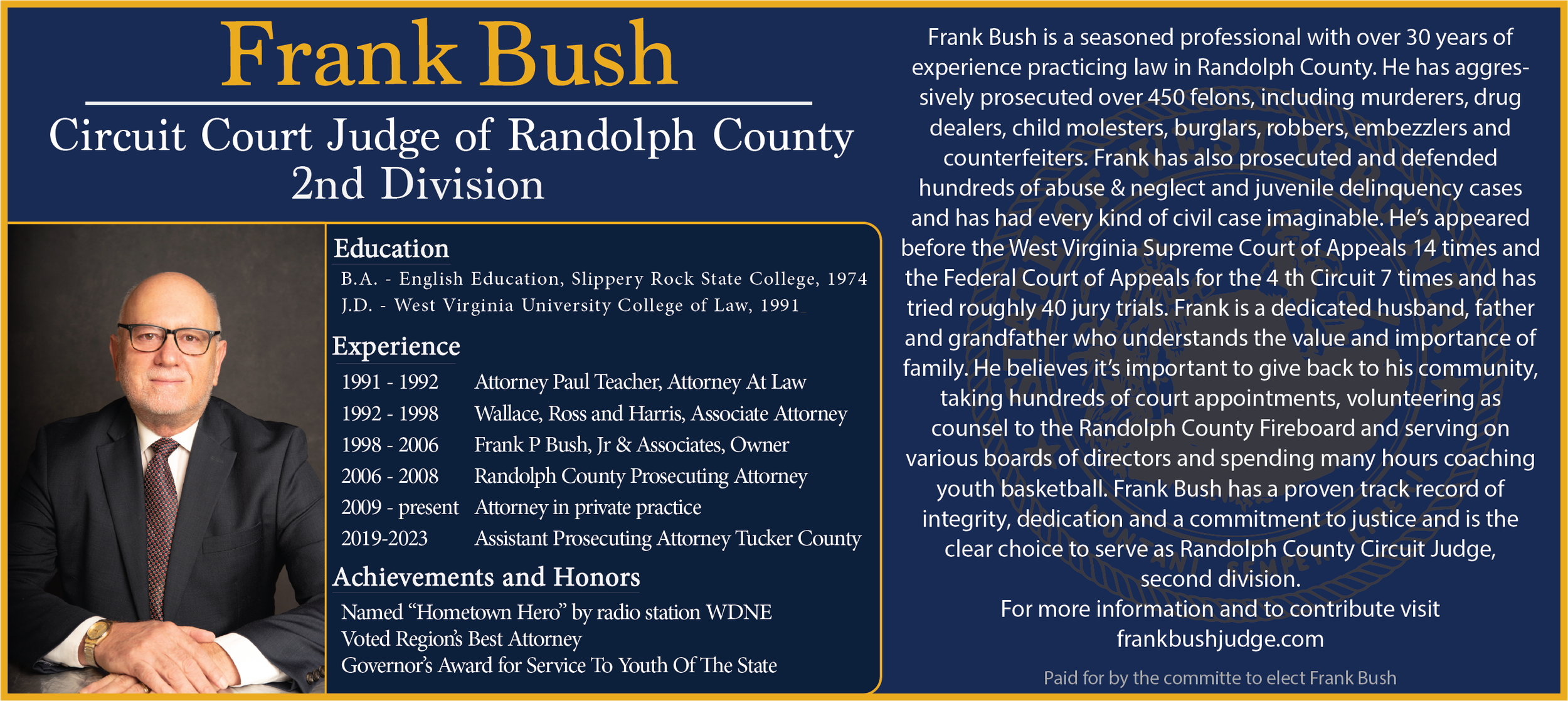
Frank Bush for Judge Campaign
• Role: Lead UX & Graphic Designer
• Project Type: Non-partisan election campaign for Circuit Court Judge
• Challenge: Present a Democrat candidate in a way that appealed across party lines, built trust, and emphasized qualifications without aggressive political messaging.
Project Goals
Create a central, user-friendly website as the hub for all campaign traffic.
Develop consistent, recognizable branding across digital and physical mediums.
Prioritize approachability and familiarity to encourage voter trust.
Ensure non-invasive, positive messaging in all outreach materials.

Phase 1:
Website Design
Goal: The campaign’s first and most important touchpoint—every ad and piece of literature would direct here.
Design Choices:
Hero Section: Full-width candidate portrait + slogan for immediate impact.
Content Flow: Mission statement → experience & qualifications → donation CTA.
Donation Placement: Button included on every page, framed positively with context on how funds would be used.
Brand Palette: Navy blue & gold (state colors) to invoke authority and local pride.
UX Considerations:
Mobile-first design for accessibility in field contexts.
High contrast typography for visibility.
Streamlined navigation for quick scanning.

Phase 2:
Yard Sign Design
Goal: Build strong name recognition through repeated visual exposure.
Process:
Researched signage from past winning campaigns in the county.
Applied consistent color palette for instant brand recognition.
Used bold typography for maximum legibility from a distance.
Insight: Yard signs aren’t just decoration—they’re a psychological repetition tool for voter familiarity.
Phase 3:
Walking Piece
Goal: A handout for meet-and-greet events, similar to a business card, offering a concise candidate overview.
Design Elements:
One-side: Candidate photo, slogan, website link.
Other-side: Qualifications, mission statement.
Compact, clean layout for easy pocket storage.
Phase 4: Field Materials
Deliverables: Door hangers, bumper stickers, t-shirts, and postcards.
Highlight: Postcard
Cost-effective and non-invasive outreach.
Targeted to specific neighborhoods harder to reach in person.
Featured approachable photography, concise messaging, and clear call-to-action.


UX Lessons Learned
Familiarity Breeds Trust – Consistent colors, fonts, and messaging increase voter comfort.
Design for the Audience You Have – Not who you wish they were. Meet them where they are in tone and style.
Every Touchpoint Matters – From a roadside sign to a website’s mobile menu, each interaction shapes perception.
Outcome & Impact
The campaign successfully established a cohesive, trustworthy brand identity in a politically challenging environment. Through strategic UX and consistent design execution, the candidate’s visibility and credibility increased significantly—without resorting to negative campaigning.