

role
UX Designer
Duration
2 Weeks
tools
Sketch, InVision, Omnigraffle, Recorder
project goals
Redesign the website to better suit the needs of a chosen persona.
Find what makes UYS different than it's competitors and emphasize those things on the website.
Advertise it's accessibility to a variety of demographics
persona

Why John?
John is a 38 year old art teacher with a 12 year old daughter. He's right around the average age in Seattle and makes around the average income. John represents A LOT of people. We appeal to John we appeal to many. Not to mention the fact that we'd also be appealing to kids and parents.
When I put persona with business I thought it was an interesting mix. Family Yoga. Seems like an obvious match but I hadn't ever heard about it. So I started digging in to the research to see if I could find out why.
research
Competitors

So who's out there? As of 2017 there are over 170 yoga studios in Seattle. To put that in some context there are just about 150 Starbucks in Seattle. I sat down with some yoga teachers and students to see what they had to say about what set one yoga studio apart from the other. What I found out was that there are some that more about the traditions of yoga. They tend to emphasize learning the origins and vocabulary and have retreats to India and that sort of thing. Some others specialize in a certain area like hot yoga. Others are more targeting the general public. More about the basics and keeping the classes light while still offering classes for various levels of experience as a way for students to work their way up. Besides those things my interviewees mentioned things like class sizes and equipment rental.
I started digging in to see what DID separate URS from the others. Right away, it has a spa, merchandise and their very own app! Not a lot of other yoga studios in town can say that. I couldn't find any information on their site about age demographics though. As a matter of fact the only yoga studio I did see with information about all ages yoga was 8 Limbs. So I went down to UYS to talk to them about it and ask why that is. What I got from the studio was basically that their age limit is 12 mostly for insurance purposes because they can't have little kids doing hot yoga. When I spoke to yoga teachers in my interviews I asked them about the kids thing. Why don't yoga studios advertise age demographics? They told me yoga studios can be wary of kids potentially running around the place unsupervised. So they may not be against it but they don't exactly advertise that they're accepting of it.
key pain points
With the information I got from the interviews I defined these key pain points as:
How to make age demographics and courses families can participate in together at Urban Yoga Spa more visible
Where to incorporate words and phrases on the site like “family activity” and “with your kids” so UYS appears in those search results
What the best way to emphasize the simplicity of beginner courses to make it more inviting to first timers
And where to generally clean up the site to make what’s unique about Urban Yoga Spa stand out and simplify navigation
screen flow
So then what I did is built up a screen flow to see what the layout felt like.

As you can see the layout is pretty flat and a lot of information is crammed in there. When you look at it this way you can see that they're not really utilizing the space very well.
prototypes
So then it was time to build the prototypes. I started with the simple paper prototype. I drew out a new version of the site with cleaner simpler navigation and clearer calls to action. I brought them to testers to see if they could:
- Find a class suitable for the whole family
- Book a session

The tests provided some great info to move forward with. There was a little confusion about the word yogis and whether that referred to the teachers or the students, questions about the program length, and what items URS has in house they can provide (towels, mats, etc.). My next iteration addressed these issues with pages about how to prepare, and better class descriptions.
Clickable Prototype
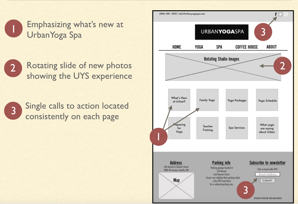
Happy with the testing results I moved onto building a proper wireframe with the changes I made. I highlighted the things that made UYS a unique studio, centered the logo to help with the structure and readability, and put forth the age demographic info that John could find when looking for something to do with his daughter.


Storyboard
So then I wanted to see the process in action. So I drew out a story in which John would find this yoga program for he and his daughter.


The storyboard is meant to depict how John would find out about yoga and why it would appeal to him. I did this to create a visual representation of the process to justify the website redesign.
final test
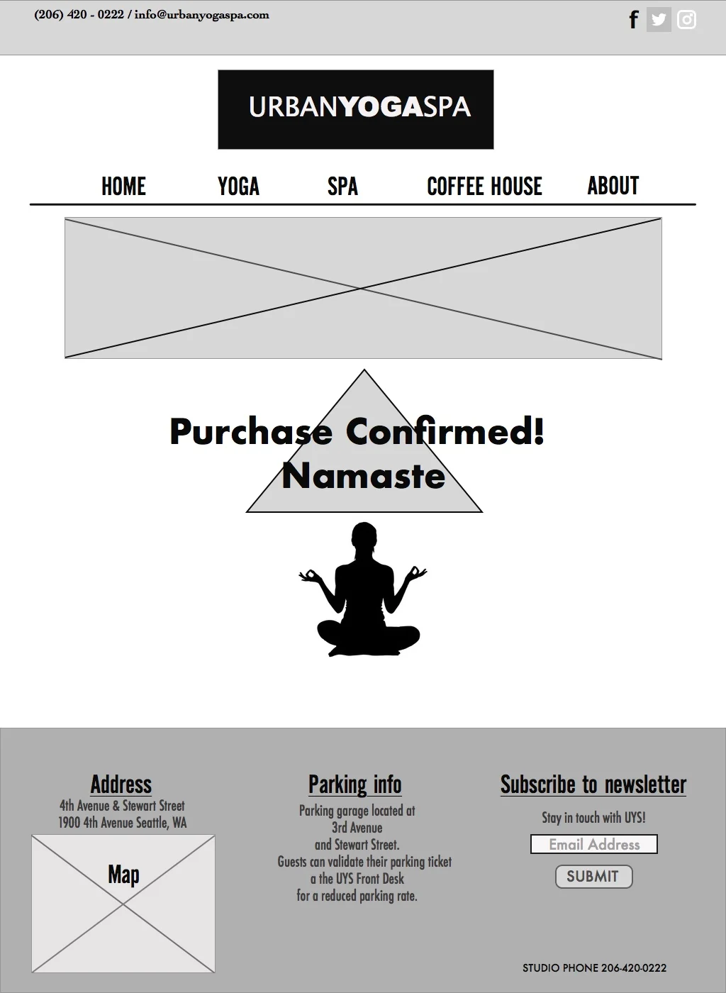
I took this clickable prototype out into the world to do some testing with people that would fit into John's demographic, parents in the 35-45 age range. The results were what I had hoped. I instructed people to just tour around the site before assigning them the task of finding a program that would be good for them and their child. Then to find a class and book it from the website. One thing I found interesting was a 50/50 split of people finding classes from the navigation bar vs people that looked through the subject boxes. The testers had a 100% pass rate so I felt the mission had been accomplished.

takeaways
This challenge began my love of research. It was motivating to find those "a-ha!" moments to keep pursuing them. I believe that we should always be digging to find the deeper why when looking to redesign and grow. Why isn't the thing we want happening or why is this thing happening that we don't want. The simple adjustments of information placement could be all it takes to make the changes needed for the growth we want.